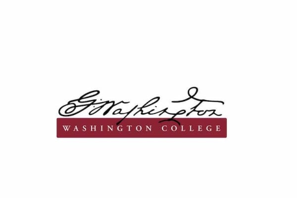
Washington College has done away with its old logo, based on George Washington’s original signature, because it’s too difficult to read, WTOP News reported.
The abandoned logo, adopted in 2013, hints at the college’s history with the country’s first president. George Washington gave the Maryland liberal arts college permission to use his name, put money toward the founding of the college, which was chartered in 1782, and served on the Board of Visitors and Governors before becoming president. The college has since changed its logo to a more modern script, according to an announcement from the college.

The old logo of Washington College, adopted in 2013.
Courtesy of Washington College
“Because cursive writing is no longer taught universally in K-12 education, the script—especially this highly stylized version—was difficult to read and not immediately recognizable for many prospective students,” Brian Speer, the college’s vice president for marketing and communication, said in the news release. “This was counterproductive when it came to name recognition and identity … When the logo was reduced to smaller sizes in ads or printed materials, it became illegible, rendering the logo ineffective.”
The new logo features the Washington family crest and the name of the college in a font that’s “modern and easy to read yet carries elements of traditional typography.”
