_Andriy_Popov_Alamy.jpg?disable=upscale&width=1200&height=630&fit=crop)
COMMENTARY
More than half of chief information security officers (CISOs) struggle to effectively communicate cyber-risk to their leadership teams, according to FTI Consulting. If you’re part of this majority, you’re not alone. I spend countless hours each month in conversation with CISOs, talking about their concerns and challenges. Time and again, I hear the same frustration: translating complex cyber-risks into a digestible narrative for leadership is an uphill battle.
The challenge is multifaceted:
-
CISOs are competing for attention in a sea of business risks. In many modern enterprise organizations, security teams exist alongside enterprise risk management (ERM) or governance, risk, and compliance (GRC) teams that track business risk holistically. Cyber concerns are just one item on a lengthy list of priorities, including financials, broader economic factors, geopolitics, climate issues, and personnel challenges.
-
Traditional risk communication tools aren’t effective storytelling vehicles. When ERM or GRC teams review risk with leadership, they often present heat maps that reduce complexity, or risk registers that overwhelm with hundreds, if not thousands, of lines of content. In either case, the nuances of cyber-risk get lost in the data, which means that leaders are disconnected from the details that matter.
-
The stakes are higher than ever. With the average cost of a data breach reaching $4.88 million in 2024, the need for clear, compelling risk communication has never been more critical.
Decoding Cyber-Risk: What Goes Into a Proximity Resilience Graph
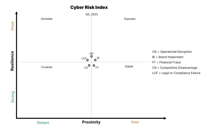
In the face of rising cyber threats and communication challenges, how can CISOs present their data to leadership in a clearer, more compelling way? I recommend creating a proximity resilience graph — a powerful visual tool that transforms abstract risk data into an engaging, actionable narrative.

Source: Recorded Future
Let’s break down the components of the graph to see why it’s so useful:
The Y-axis, labeled Resilience, represents an organization’s cybersecurity muscle. It encompasses all controls, efforts, plans, processes, technologies, and resources, going well beyond standard GRC checklists. For example, imagine implementing a gamified phishing training program. As employee engagement and resilience against social engineering improve, you’d see this reflected in a downward movement along the Y-axis. This axis is crucial because it showcases the tangible impact of an organization’s security investments and initiatives.
The X-axis, labeled Proximity (as in Attack Proximity), captures the totality of threats surrounding an organization. When mapping this axis, a CISO should use all the security and threat data available to them from internal security telemetry, external threat telemetry, and public cyberattack events. For instance, if a healthcare company discovers a spike in ransomware attacks targeting its sector, attack proximity would shift right. Similarly, if a manufacturing firm’s security operations center (SOC) detects a surge in phishing attempts, that internal telemetry signal would move proximity to the right as well. This axis provides vital context, showing how internal and external factors influence an organization’s risk posture.
The graph midlines help viewers visualize movement, and the top label is the absolute reference to anchor time increments. The amount of movement and the midline labels are flexible, turning it into a dynamic story that shows the evolution of an organization’s security posture. A CISO should choose a time segment that’s large enough to show movement. If they meet quarterly with their board or directors, they can use the start of a quarter as the label.
The quadrant labels — Unstable, Stable, Exposed, and Covered — are simple and expressive, but a CISO can adjust or eliminate them as needed after seeing their effect on audience engagement and comprehension.
Finally, the data points represent the five key risk impacts: Operational Disruption, Brand Impairment, Financial Fraud, Competitive Disadvantage, and Legal or Compliance Failure. Ultimately, the proximity resilience graph provides value by highlighting movement, showing whether resilience is improving or getting worse for a particular risk impact. For example, after a successful ransomware tabletop exercise, the Operational Disruption point would shift down on the Y-axis, indicating improved resilience. This granular approach allows for nuanced discussions about specific risk areas, rather than generalizing all cyber-risk.
On the X-axis, threat categories fuel risk impact movement, and it’s up to CISOs to translate how threat categories map to various risk impacts. For example, a business email compromise (BEC) primarily creates a Financial Fraud risk impact, but it might also trigger Brand Impairment if the event becomes public.
Bridging the Communication Gap: Build Your Proximity Resilience Graph
Not only does a proximity resilience graph offer a more accurate representation of risk than heat maps and risk registers, it also allows CISOs to tell a complex story in a single visualization. It avoids subjective labels and allows for different interpretations so leaders can see where and how resilience is changing and start asking informed questions. It also eliminates the chance of cyber-risk getting lost in the noise of broader business risk.
A proximity resilience graph enhances leaders’ risk comprehension and engagement, boosts their confidence in the timing of present and future cybersecurity investments, and improves perceptions of the security team’s value.