Build Inclusive Courses For All Learners
Building inclusive spaces goes beyond ramps and elevators—it’s about making the digital environment open to everyone, as well. As education moves online, it’s time to focus on designing eLearning content that people can access conveniently. Read on and discover how to build truly inclusive, accessible online learning with 15 simple, actionable practices.
Modern Standards And Principles Of Accessible eLearning
Various laws and standards are in place to make sure online learning is inclusive and nondiscriminatory:
- Americans with Disabilities Act (ADA). This US law prohibits discrimination against individuals with disabilities and mandates that public spaces, including online platforms, be accessible.
- Section 508 of the Rehabilitation Act. It requires US federal agencies to ensure that their electronic and information technology, including eLearning, is accessible to people with disabilities.
- European Accessibility Act (EAA). This law requires that digital products and services be accessible to people with disabilities across EU states.
- Web Content Accessibility Guidelines (WCAG 2.0). This set of internationally recognized standards calls for making web content more accessible to people with disabilities.
WCAG 2.0 is especially important: it provides actionable guidelines that help developers and creators build digital content that’s accessible to a wide range of users. WCAG 2.0 states that web content, including eLearning, should be:
- Perceivable. Information and UI components must be accessible to all users (e.g., providing text alternatives for images).
- Operable. Users should be able to navigate and interact with the content easily.
- Understandable. Content and instructions must be clear.
- Robust. Content should work across different devices and technologies.
Compliance with these regulations isn’t just necessary to avoid legal consequences. It’s a must for creating and delivering equitable learning for all. Besides, by ignoring the accessibility guidelines, you risk excluding learners with disabilities, potentially facing reputational damage on top of legal issues.
Did You Know?
Instead of going through the hassle of retrofitting accessibility into your content, you can choose an authoring tool that supports creating accessible content from the start. For instance, iSpring Suite enables you to build courses, quizzes, videos, and eBooks that fully comply with Section 508 and WCAG 2.0.
Building Accessible eLearning: The Top 15 Simple Practices
Consider a few tangible changes you can make to learning content to turn your courses into truly inclusive eLearning, broken down into 4 main categories.
Language, Syntax, And Typography
First, your learners should be able to read and understand the written material without any hindrances. Work on your text, content structure, and overall delivery:
- Use a clear content structure. Create a simple hierarchy of visible headings with the proper markup. Break down large chunks of text into smaller paragraphs. Implement bulleted and numbered lists.
- Go for legible fonts and font sizes. A rule of thumb is to select a font size of at least 16 pixels for the main body text. It’s also important to choose fonts that are clear and easy to read.
- Follow consistent alignment. Align text consistently throughout your content, preferably left-aligned for most languages. It improves readability and creates a clean, organized appearance. Avoid justified text, which can create uneven spacing and make reading more difficult, especially for people with dyslexia.
- Simplify your delivery style. Avoid long, complex sentences. Instead, keep them short and to the point. Use familiar words and phrases that are easy to understand. Stay away from jargon, slang, or technical terms unless they are well-explained or essential to the content.
Take a look at this example of an accessibility makeover below. The slide on the left doesn’t have clearly defined paragraphs or sections, features bulky, long sentences, and the font size is too small for learners with visual impairments. The slide on the right, however, is clearly structured, legible, and more easily understandable both in terms of content and layout.

Colors And Illustrations
While various color schemes and images enrich learning content, they should be used thoughtfully to enhance comprehension without causing distractions or confusion. Here’s how you can make pictures and colors your accessible eLearning assets:
- Offer text alternatives for images. Provide alt text that concisely describes the image’s purpose and content. This way, learners who can’t see the illustrations can still understand why you included them in the content and what they mean.
- Avoid text in pictures. Screen readers can’t interpret text embedded within images, making it inaccessible to visually impaired learners. Instead, place text outside the image to ensure everyone can access the information.
- Use high-contrast colors. When text and important elements stand out clearly against the background, your content is easier to read and perceive.
- Don’t rely on colors alone. Keep colorblind learners’ needs in mind when you use color as a source of information in infographics. For example, if you’re using green and red to differentiate between positive and negative trends in a chart, also include distinct symbols like upward and downward arrows to ensure the information is accessible to those who can’t distinguish the colors.
Audio And Video
Audio and video elements are great additions to your courses, but they might be inaccessible to people with hearing impairments or visual disabilities. Provide these learners with alternative formats.
- Transcribe audio. Thanks to transcripts, learners with hearing impairments will be able to access the information in text form without missing any critical details.
- Use captions and subtitles for videos. This is a great text-based alternative for video dialogue and sounds for those learners who are deaf or hard of hearing.
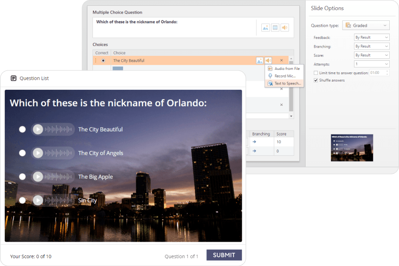
- Add voice-overs to quizzes. Adding voice narration to quizzes helps learners with visual impairments or reading difficulties understand and interact with assessments.
Did You Know?
In iSpring Suite’s QuizMaker, you can record audio versions of quiz questions and answers and add them to your assessment. Combine written and audio quiz elements or make entirely audio-based quizzes—whatever accommodates your audience’s needs.

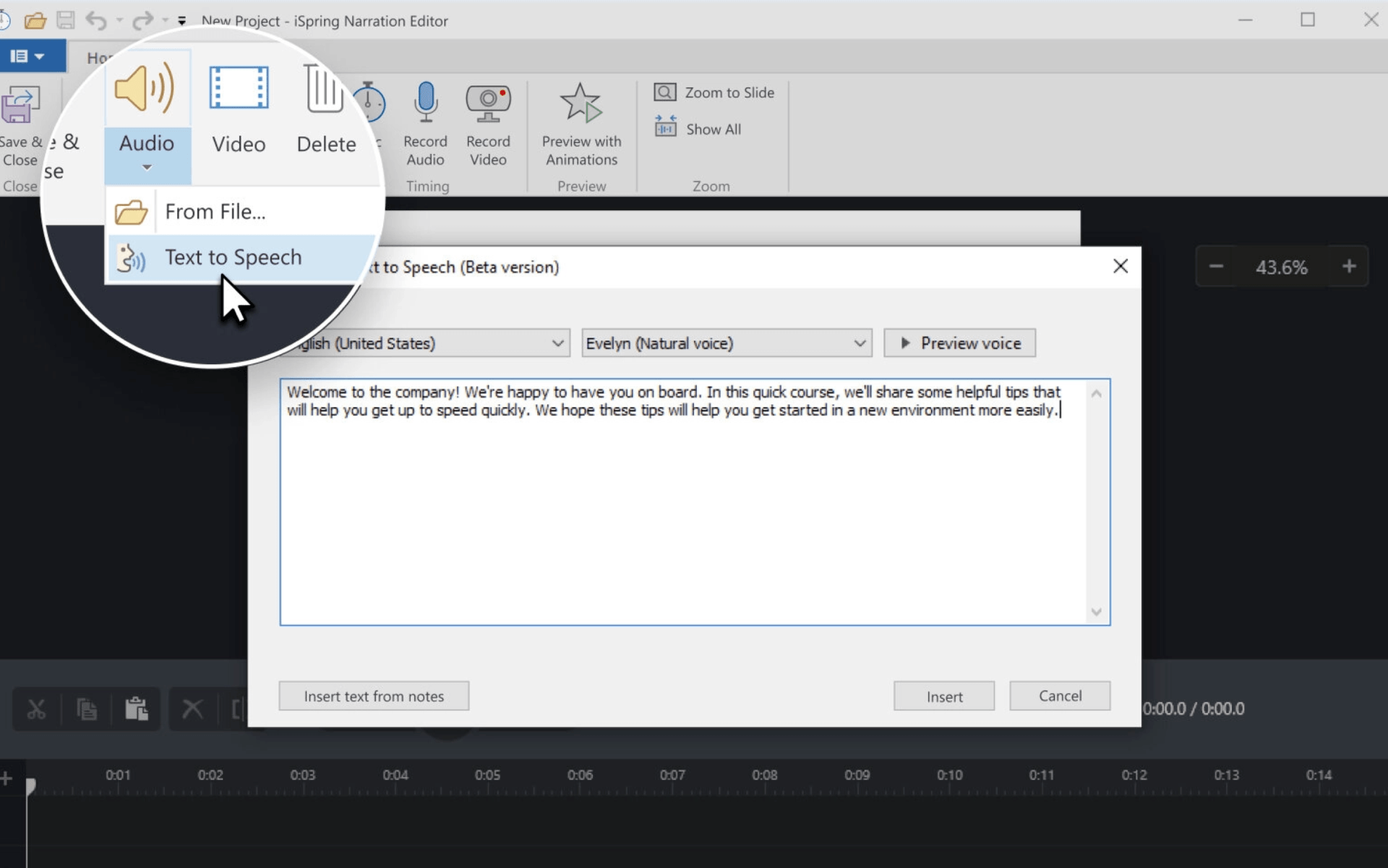
Pro tip: If you need to voice your quizzes but don’t have pre-recorded audio, you can use iSpring Suite’s text-to-speech feature. It allows you to create narrations with natural-sounding AI voices for your courses and localize your content quickly for multilingual audiences.

Interactivity And Navigation
Interactivity and navigation are crucial components of eLearning. They help engage learners and guide them through the content effectively. Stick to an inclusive approach when you implement them:
- Use simple navigation. Stick to the principles of intuitive and predictable navigation: place buttons like “Next” and “Previous” consistently in the same location on each page, and use clear, descriptive labels for all interactive elements.
- Incorporate screen reader compatibility. Ensure that all interactive elements, including navigation menus and activities, are fully accessible to screen readers by using proper HTML markup and Accessible Rich Internet Applications (ARIA) labels. This allows visually impaired learners to engage with your course or quiz effectively.
- Create keyboard-friendly interactions. Ensure that all interactive elements, like buttons, links, and form fields, can be easily activated using keyboard commands, such as the Tab, Enter, and arrow keys. This makes the content accessible to users who rely on keyboards instead of a mouse.
- Add alternative ways to participate in activities. Offer options like text-based input for drag-and-drop tasks or provide written descriptions alongside interactive elements.
Did You Know?
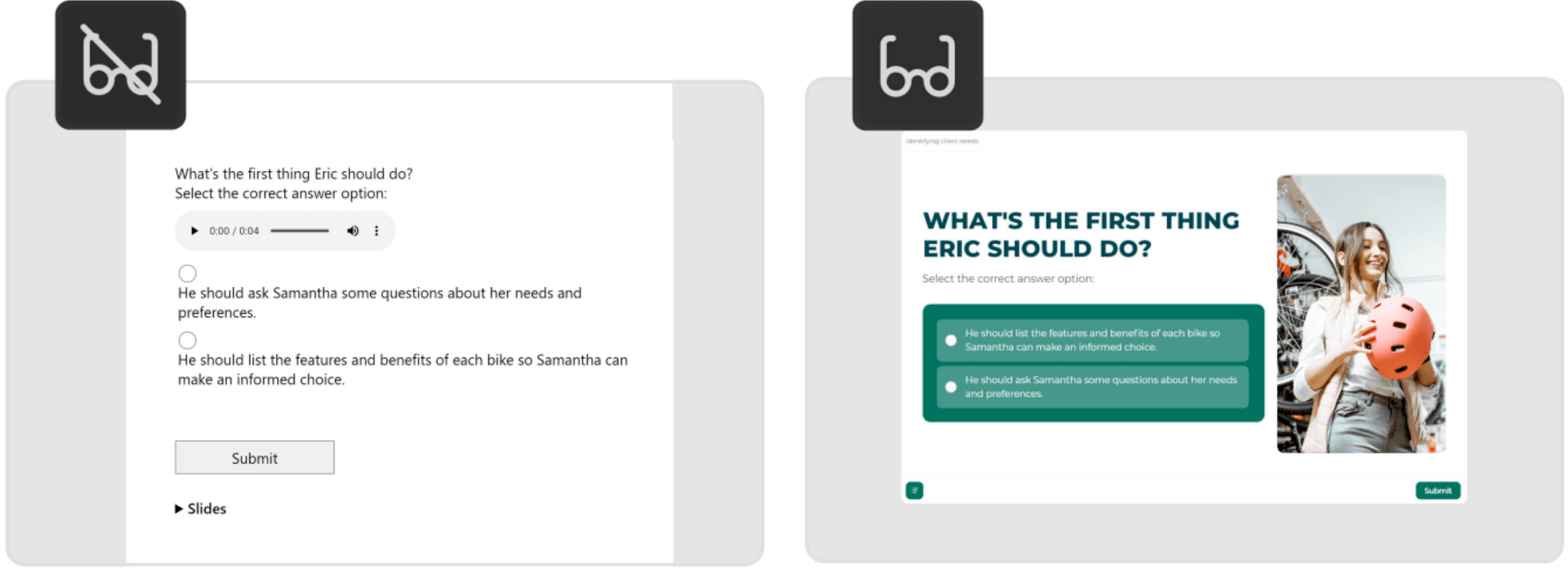
Creating different versions of activities manually can be time-consuming and resource-intensive. You can increase the efficiency of your course creation process and ensure accessibility with iSpring Suite thanks to its built-in Accessibility Mode functionality. The tool publishes learning modules in a format that enables learners to switch to Accessibility Mode with a single click.
The Accessibility Mode provides more perceivable text, a minimalistic layout, and screen-reader-friendly content. For example, here’s what a quiz question looks like in different modes, depending on the learner’s needs and preferences.

You can see a sample of a course built in iSpring Suite with an embedded Accessibility Mode by clicking on this link.
Final Word
Accessibility in eLearning is more than a standard to follow. By building inclusive content, you help ensure that every learner gets equal access to educational opportunities. Stay committed to this principle and implement the relevant practices above consistently in every course, quiz, or presentation you create.
One more piece of advice: remember to regularly test your content with real users to identify and address any accessibility issues that may come up. Learners’ feedback is your most valuable resource for refining and improving the learning experience.
