
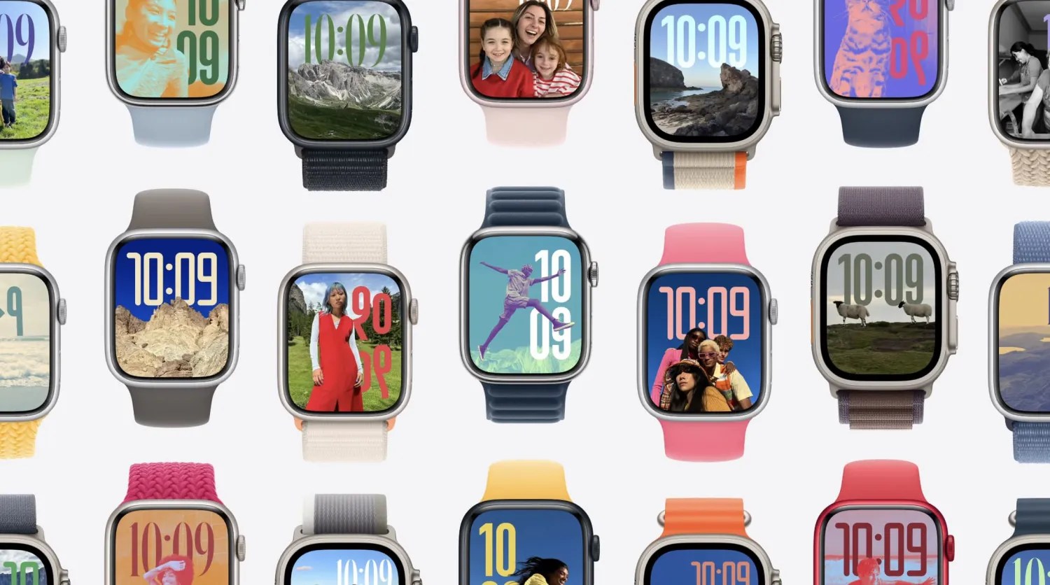
Apple Watch Series 9 and Ultra 2 introduce the double tap gesture, and I’ve found that the upcoming watchOS 11 update makes the hands-free input method more useful.
Double tap lets you interact with the Apple Watch by doing a two-tap gesture with your thumb and finger with your watch-wearing hand. This gives you the ability to do things like reply to messages and scroll through lists without touching your watch.
While the gesture provides a practical way to interact with the Apple Watch when you’re carrying something in your other hand, double tap is also natural and reliable enough to mindlessly do it when checking your watch for updates, even if both hands are free.
A new feature coming in watchOS 11 has turned my Apple Watch double tap usage way up — don’t say it, don’t say it, don’t … to eleven.
What I like about double tap in watchOS 11
You may have heard the news: watchOS 11 eliminates the Siri watch face as predicted. What was great about the Siri watch face? Contextualization. It could intelligently display relevant information based on time, location, and activity. But fear not, Siri watch face fans, as the spirit of the Siri watch face lives on throughout watchOS 11.
watchOS 10 introduced the Smart Stack, a vertically scrollable set of widgets that’s a swipe up or double tap away from the watch face. What’s new in watchOS 11 is that Apple has made Smart Stack react to time, location, and more. Version 2 of the Smart Stack is basically a more capable version of Siri watch face.
What does double tap have to do with all of this? Prior to watchOS 11, double tap was handy for doing things like selecting the reply button in messages, interacting with timers, and opening the pre-configured Smart Stack. You kind of knew what you were getting when you invoked Smart Stack with a double tap.
Starting with watchOS 11, Smart Stack is much more intelligent about what information it presents. This change has made using double tap to show the Smart Stack a mindless habit. While you can still pin and reorder widgets, it’s the dynamically displayed widgets in different contexts that have impressed me.
Post-workout
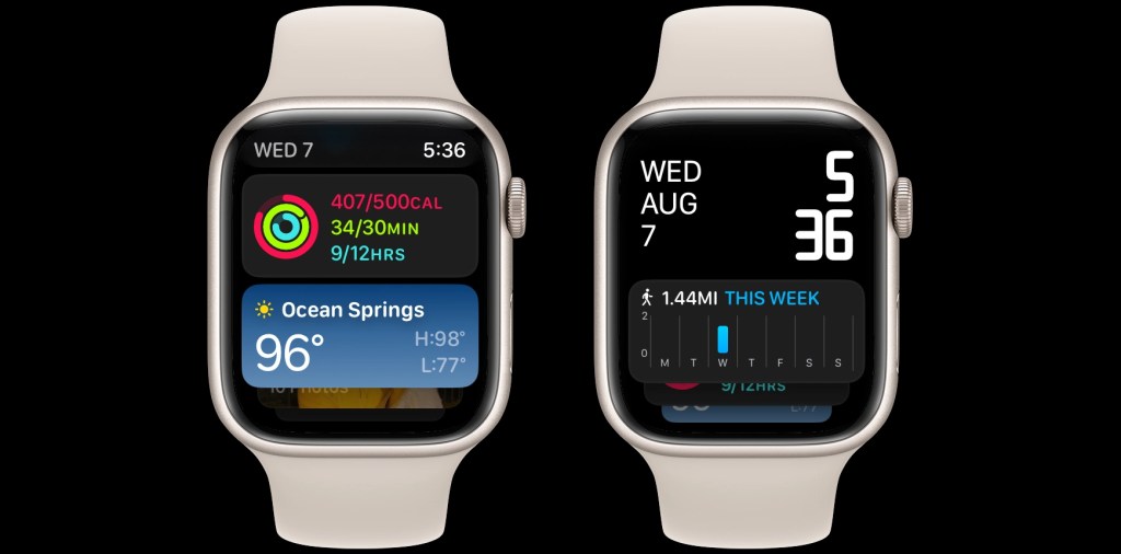
For example, after an evening walk along the beach, Smart Stack presented a widget displaying how many miles I’ve walked this week. Next in the stack: activity ring progress and weather data.
Leaving home
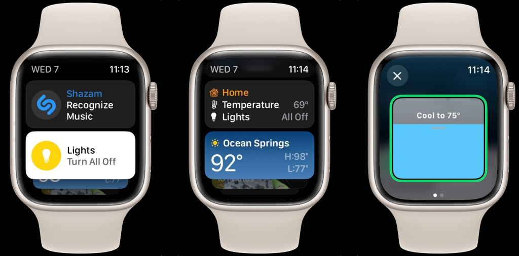
Another time, double tapping to invoke Smart Stack presented HomeKit controls after leaving my house. This included a big button to turn all my lights off with a single tap. After turning off the lights, the widget turned into a HomeKit status card, confirming all the lights were off while displaying the thermostat temperature. Tapping the widget opened the Home app, allowing me to turn down the air condition while I was away. Clearly I haven’t set up HomeKit automations, and Smart Stack in watchOS 11 was helpful.
At the movies
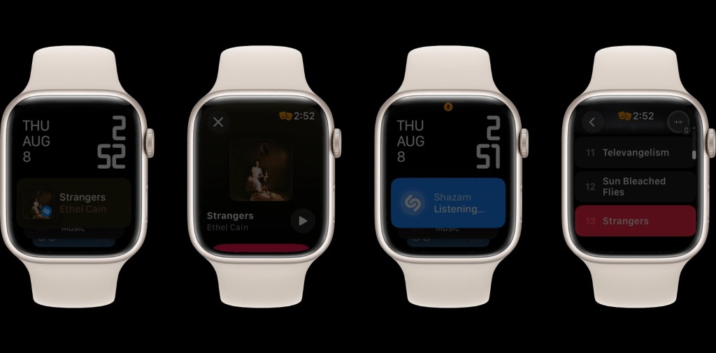
Don’t worry, I’m not a phone user at the movies. My Apple Watch goes into Theater mode (Do Not Disturb + display disabled). However, a song I didn’t recognize played during the last movie I saw. I knew about watchOS 11’s new ability to present the Shazam widget in the Smart Stack when music is detected. I slowly rolled the Digital Crown on the Apple Watch to dimly light the screen, double tapped to invoke Smart Stack, and tapped the Shazam widget to recognize music. Bam! Now the song is in my Shazam playlist on Apple Music.
Morning and evening
Using double tap to check the Smart Stack has become part of my wake up and wind down routine. In the morning, Smart Stack displayed sleep tracking data from the previous night’s rest, the current temperature with highs and lows, and what time to expect sunrise. In the evening, Smart Stack showed a HomeKit status widget, a Mindfulness prompt, and featured photos.
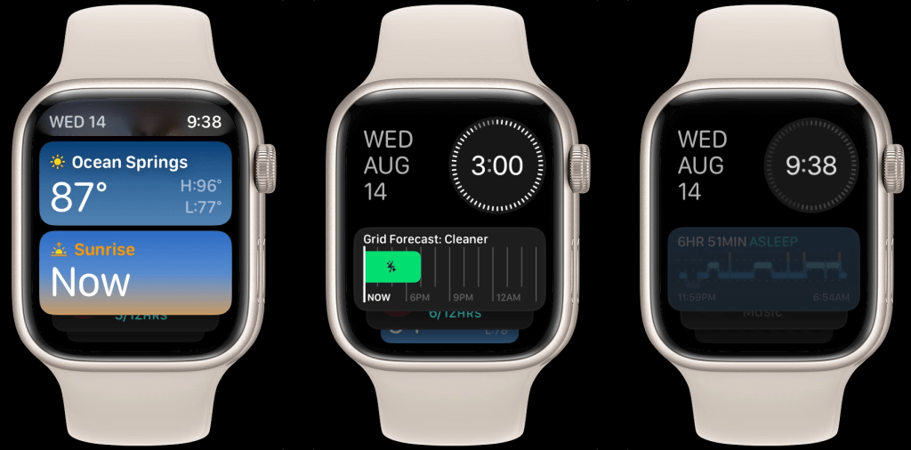
You don’t need an Apple Watch Series 9 and Ultra 2 to benefit from contextual widgets in watchOS 11. Swiping up from the watch face invokes Smart Stack on all watches that run watchOS 10 and later. However, double tap is the hidden feature that makes the new and contextually aware Smart Stack so much more delightful and useful.
Double tap once to present Smart Stack, double tap again to scroll through the widgets, and tap on a widget to send a command or open the app for more information. While watchOS 11 is packed with new features throughout the system, it’s double tapping to discover what the new Smart Stack has to offer that has impressed me again and again.
One thing I would change in watchOS
Finally I have one feature request for what the double tap gesture is capable of doing in watchOS.
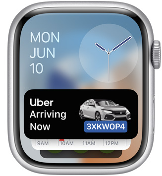
If you glance at a notification, you can use double tap to act on that alert. If you swipe down from the watch face and open Notification Center, double tap scrolls through your alerts until you reach the end.
While Smart Stack is now contextually aware, the carousel of widgets don’t offer much when it comes to catching up on notifications. In a future update to watchOS, I would love to integrate notifications in the widget stack. This would make the one double tap gesture useful for both the swipe up and swipe down gesture on the Apple Watch.
Smart Stack in watchOS 11 is already gaining the ability to show Live Activities, a more robust form of notifications, so actual notifications wouldn’t be too far off. Thoughts?
FTC: We use income earning auto affiliate links. More.